Finding your way
Tour the Intelligence screen: the menu in three pillars, the brand picker, your home page, the header's AI layer, Activity and credits, and busy buttons.
Just signed in to Intelligence by BearingBridge and not sure where things are? This tour starts with the menu on the left, grouped in three pillars, and works its way across the header. It ends with the small signals buttons give while they work. The app gives you its own tour too: the Discovery page and its quick guided tour, described in Discovery and tips.
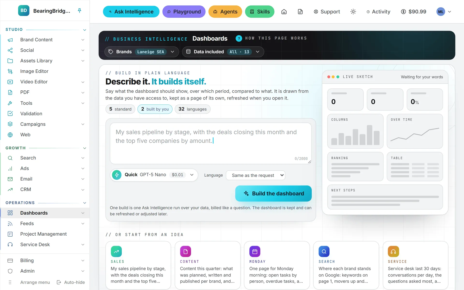
The left menu
The menu down the left side holds the modules you work in, grouped under three colored headings, the three pillars of the app:
- Studio, in cyan, makes the content: texts, images, videos and posts in your brand’s voice, approved, then gathered into campaigns.
- Growth, in green, finds, reaches and wins customers: search, ads, email, and the CRM where the deals close.
- Operations, in steel blue, runs the business and serves your customers: dashboards, feeds, projects and the service desk.
Each module’s pages wear a shade of their pillar’s color, in the buttons, the charts and the highlights, so you can tell at a glance which pillar you’re in.
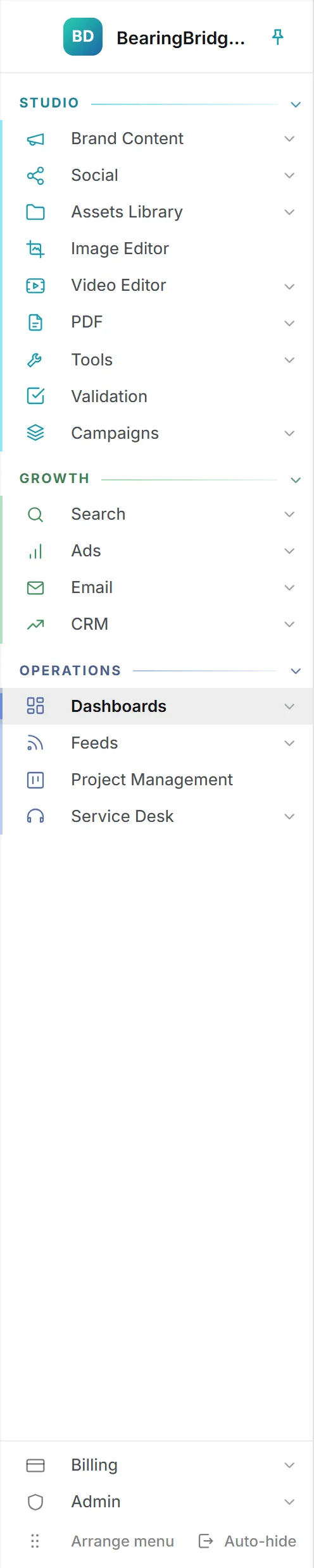
Click a pillar’s heading to fold its groups away, and click it again to bring them back. Your browser remembers which pillars you folded. The pillar holding the page you’re on always opens, so you never lose sight of where you are.
Inside a pillar, each module has its own group. A group with several pages opens when you click its name, and its pages appear underneath; clicking another group folds the first one away. A group with a single page, such as Validation, opens that page directly.
Don’t be surprised if a colleague’s menu looks different from yours. An area your organization doesn’t have, or that your role can’t open, isn’t drawn at all, and a pillar with none of your modules disappears with them. If something you need is missing, ask an admin of your organization. Capabilities and modules and roles and rights explain how access is decided.
What’s in each group
| Pillar | Group | Pages inside |
|---|---|---|
| Studio | Brand Content | Text, Image, Video |
| Studio | Social | Calendar, LinkedIn, Instagram, Facebook, TikTok, YouTube, X |
| Studio | Assets Library | Assets, Shorts autopilot |
| Studio | Image Editor | Image editor |
| Studio | Video Editor | Video editor, Shorts autopilot |
| Studio | The eight PDF tools | |
| Studio | Tools | Image anonymizer, YouTube downloader |
| Studio | Validation | Assets |
| Studio | Campaigns | All campaigns, and one page per campaign |
| Studio | Web | Sites, and one page per site |
| Growth | Search | Analytics, SEO, GEO |
| Growth | Ads | Google Ads, LinkedIn Ads, Meta Ads |
| Growth | Answering Machine, Mass Mailing, Prospects, Lists, Sequences | |
| Growth | CRM | Pipeline, Clients, Contacts, Suppliers |
| Operations | Dashboards | Dashboards, then one page per standard dashboard: Visibility, Watchers, Content, Commercial, Delivery. A dashboard only shows when you have the area it reads. |
| Operations | Feeds | Your news reader: All, Read later, then your own folders and sources |
| Operations | Project Management | Board |
| Operations | Service Desk | Desks, then one entry per desk |
| Outside the pillars | Partner | Users, Invitations, Commissions (commercial partners only, above the pillars) |
| Outside the pillars | Billing | Buy Credits, Invoices, Usage |
| Outside the pillars | Admin | Organization, Connections, Brands, Users, Capabilities, Credits, Projects, AI Models, CRM (admins only) |
New accounts get the pillars and their groups in that order. Two groups carry a shorter name in the menu than the capability behind them: CRM is the Sales capability, and Dashboards is the Business Intelligence capability. The Capabilities page and the rights grid still use the capability names.
Feeds and Email are the two groups nothing can switch off: every account has them, in every role. Inside Email, Prospects, Lists and Sequences follow the Prospects and Sequences right of your role. Billing and Admin always sit at the foot of the menu, outside the pillars. The CRM entry under Admin only appears when your organization has Sales.
Ask Intelligence, Playground, Agents and Skills aren’t in any pillar. They’re the AI layer that works across all three, and they sit in the header.
Pinned, auto-hide or drawer
On a computer the menu has two modes. Pinned, it stays fully open and the page sits beside it. On auto-hide, it shrinks to a narrow rail of icons and slides open when your mouse rests on it (on a touch screen, the first tap opens it).
Switch modes with the pin icon at the top of the menu or the Auto-hide button at its foot, which then reads Keep pinned. Your browser remembers the mode.
Tip: The backslash key (
\) switches between pinned and auto-hide from any page, as long as you aren’t typing in a field. The pin icon’s tooltip reminds you of it.
On a phone or a narrow window, the menu becomes a drawer. The Menu button at the left of the header opens it. Tap outside it to close it, or use the X or Escape. The backslash key opens and closes it too.
Arrange the menu in your own order
- Click Arrange menu at the foot of the menu. Every pillar opens, and arrows appear next to each pillar heading and each row.
- Drag a pillar to its new place, or move it with its up and down arrows. Its groups travel with it.
- Drag a group to its new place within its pillar, or move it with the arrows. A group stays in its own pillar: CRM can move to the top of Growth, but not into Studio.
- Open a group with its arrow to reorder the pages inside it the same way.
- Click Done.
Each move is saved on your account right away, so the menu shows your order in every browser you sign in from. Reset to the default order, shown while you arrange, puts the pillars, the groups and the pages back where the app had them. Billing and Admin can’t be moved. If a move doesn’t stick, the menu says “Could not save the menu order.”
The Feeds group is the exception inside. Its group can be moved like any other, but what sits under it is your own folders and sources, and those are put in order by dragging them where they are. See feeds.
The brand picker
On a page that works per brand, the brand picker sits in the black band at the top of the page, under a small Brand label. Open it to see No brand first, then every brand of your organization, each with its logo or color. If your brands come from more than one organization, they’re grouped under each organization’s name.
Picking a brand filters the page you’re on, with no reload. Your browser remembers the choice for the next page. When the selected brand has a module switched off, that module leaves the menu until you pick another brand, and a page for it says “The … module isn’t enabled for” the brand, with a pointer to the Brands page.
Some pages don’t work per brand at all. CRM, Project Management, Billing and Admin cover the whole organization, so they show no brand picker. Brands covers what the No brand workspace holds.
Your home page
Your home page is where you land after signing in, and where the logo at the top of the menu takes you. Out of the box that’s the first dashboard of the Dashboards group, whichever one you moved to the top of it. If your account doesn’t have dashboards, it’s Feeds, the one module every account has. Commercial partners start on their commissions.
To make the page you’re on your home page, click the house icon in the header. The icon fills in to show that this page is now home. Click it again to go back to the default. Settings > Home page offers the same choice as a list, under Open this page when I sign in, with Default for my role at the top.
A link to a specific page still opens that page, not your home page. And if you lose access to the page you picked, signing in takes you to the default instead.
The header
That’s it for the menu. The header across the top is where the everyday controls live.
On a wide screen the controls on the right of the header start with four buttons: Ask Intelligence, to ask questions about your own data; Playground, to talk to an AI model directly; Agents; and Skills. Together they’re the AI layer of the app: they belong to no pillar because they work across all three, on whatever your role lets you read. Each opens its own page in the same tab. On a phone there’s no room for them in the header, so they move into the menu drawer, near the top.
Then come the house icon; the notepad button that opens your Scratchpad, a drawer for your own notes, files and recordings (Alt+N does the same from any page); Support, a chat that answers your questions from this help center (see contact support); a sun or moon button that switches between light and dark in one click; the Activity button; your credit balance; and the button with your picture or initials.
Activity
Long jobs, like an article being written or an image being drawn, show up under Activity. While something runs, the button turns into a ”/” spinner with a count, like “2 running”. A small badge counts jobs that finished while you were on another page.
Open it and you’ll see what’s running and the last jobs that ended, each with its brand and how long it took. Click one to go to its page. Clear finished empties the recent list. When a job ends while you’re somewhere else, a notice pops up in the lower right corner with an Open button.
Credit balance
The amount next to the coin icon is what you can spend right now, in US dollars. Running low, it turns amber. At zero it goes red and reads Buy credits, and AI features stay off until you add some. If your organization shares credits, hover it for the breakdown: what’s left of your daily allowance on the shared credits, plus your own credits. Click it to open Billing.
After each paid run, the balance flashes the amount that run took, then settles on the new total. How the shared and personal credits work is explained in credits and costs.
Your profile menu
The button with your picture opens a menu headed by your name and your sign-in address. It links to User Settings, Log, Discovery, Billing & credits and My Connections, plus Admin if you’re an admin. Log lists your own runs, notifications, agent runs, emails, sign-ins and spending; see Log. Discovery opens the page you landed on at your first sign-in, with every module you can open and the quick tour of the screen; see Discovery and tips. Appearance switches between System, Light and Dark; the choice belongs to the browser, so your phone and your laptop can differ. When your organization offers more than one language, a Language · Langue · 语言 row lets you switch the interface. Sign out is last. Settings repeats the Appearance choice and adds a Language card that keeps your language on your account; both are described in date, time, language and theme.
The page header band
Every page opens on a dark band with its name in it. Most bands carry a How this page works link with a question mark; click it for a short plain-language explanation of the page. The page’s own buttons and filters sit on the right of that band. Inside some pages, a smaller note with the same question mark, often titled What am I looking at?, does the same job for one section.
Spinners, amber buttons and prices
Click a button that starts real work and it shows a ”/” spinner, then ignores further clicks until the work is done. A form being saved freezes the same way, so nothing gets saved twice. Moving to another page shows the same spinner in the middle of the screen while the page loads.
Change a field on a card that has its own Save button and the button turns amber. It means the change isn’t saved yet. It goes back to normal when you click it.
Paid actions tell you what they cost. Many show the price before you start. The image form, for one, prints what a single image costs at the settings you picked. The result then shows what the run cost, and the balance in the header drops by the same amount. What costs credits lists them.
The rest of what this tour covers is free: arranging the menu, switching brands, setting a home page and changing the theme use no credits.
Links at the bottom of every page
At the bottom of every page: a Help center button, then Report a bug, Contact us, bearingbridge.com, What’s new, Terms of Service and Privacy Policy. Each opens in a new tab, so you don’t lose your place. Help center is this site. The rest is covered in reporting a bug, what’s new and terms and privacy.
One more thing worth knowing before you start: a handful of keys save time on the screens you live in. They’re all in keyboard shortcuts.